Design Sprint 2026
Brand Identity
The Project
Design Sprint 2026 is a major virtual creative workshop – a three-week intensive learning experience focused on Adobe Photoshop, Illustrator, InDesign, and modern AI tools. The identity needed to communicate creativity, momentum, growth, and professionalism, while also capturing the energy and inspiration participants feel as they kickstart their new creative year.
ROLE
✅ I developed the entire visual concept and logo identity for Design Sprint 2026. This included research, idea generation, sketching, shape exploration, and creating a refined black-and-white logo system that expresses creativity, movement, and professional growth.
Project Results
🏆 This identity successfully combines creativity, energy, and professionalism in a single expression — exactly what Design Sprint represents. The logo is flexible, inspiring, and future-ready, serving as a strong visual symbol for an international creative community.
Projects Overview
01- Brief & Inspiration
Client Requirements
The client requested an identity that is:
- Modern, energetic, and inspiring
- Professional, yet playful
- Simple and instantly recognizable
- Functional across digital and print
- Built as a logotype or symbol that can be updated annually (2026, 2027, etc.)
In short: a logo that can stand confidently on its own — an icon of creative momentum.
And when colors are applied: it should remain fun, simple, and warm.
Target Audience
The event targets graphic designers and illustrators aged 20–45 who are ambitious, learning-driven, and visually aware. They seek professional development, modern workflows, and a sense of community, and they value clear visual communication, contemporary design, and authenticity.
The identity therefore needed to appeal to creatives who want to elevate their skills, expand their portfolio, and receive expert guidance from an Adobe-certified instructor.

02- Research & Creative Direction
My research focused on three main themes: Movement & Forward Momentum, Design Tools & Symbol Language, Creative Energy & Transformation.
My visual references were chosen to reflect “Sprint” as a creative journey and process.
Mindmap

03- Design Process
Sketching & Digital Form Studies
Hand-drawn experiments exploring: letterforms, monograms, symbolic elements (rocket, pen nib, arrows), rhythmic line patterns, motion lines in different directions.
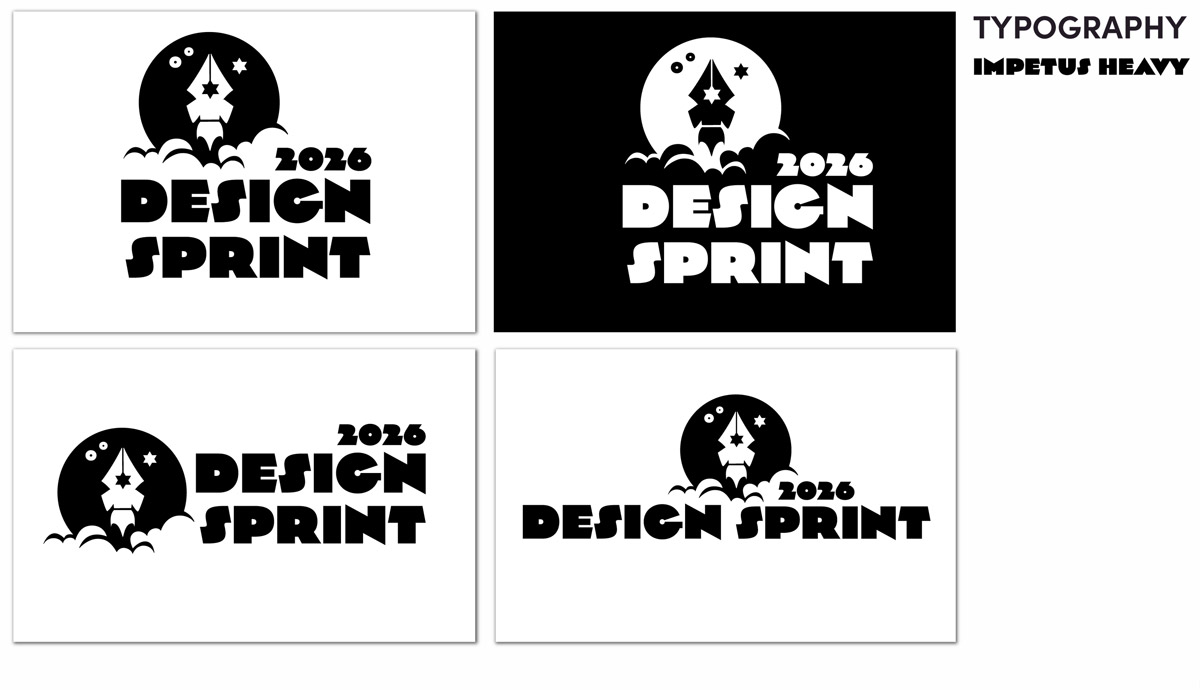
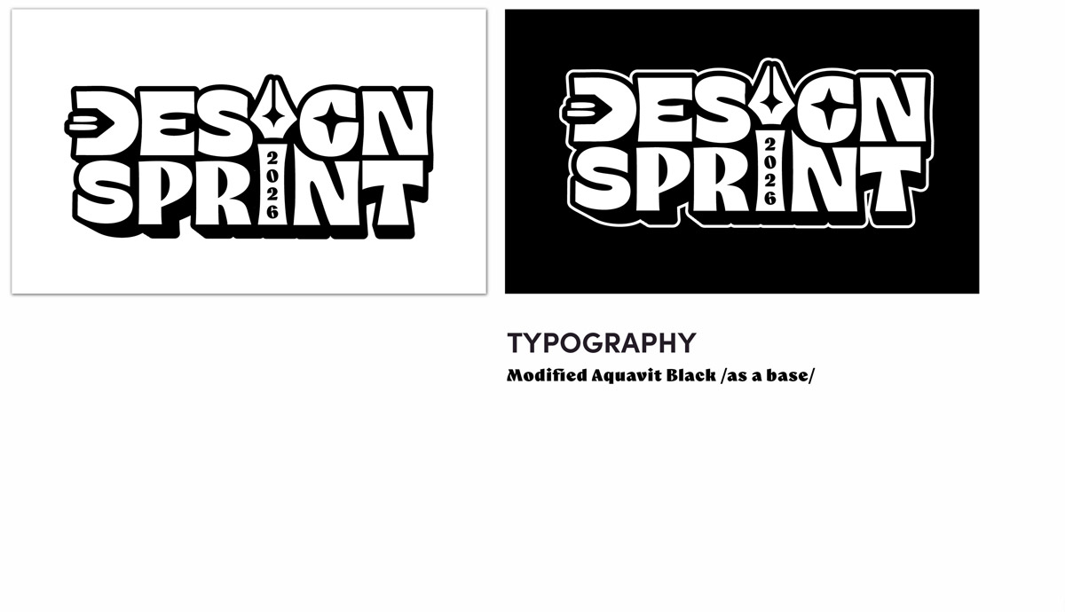
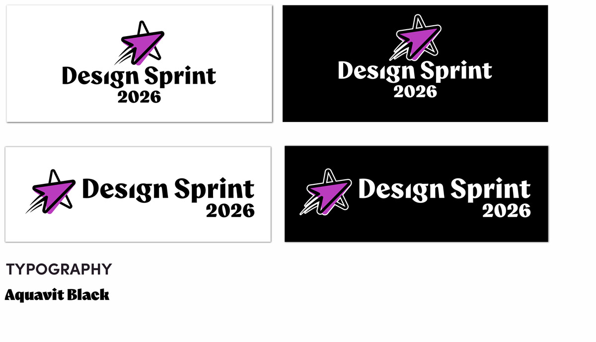
I developed more than 30 black-and-white logo explorations divided into several directions: Pen Tool + Rocket hybrid concepts, DS monogram variations, Typographic logos with integrated symbolic details, Energy-based systems using arrows and speed.

Selection & Refinement
This direction was then developed across multiple variations and refined into the final logo. All elements were studied in black and white to ensure that the concept remained strong without relying on color.
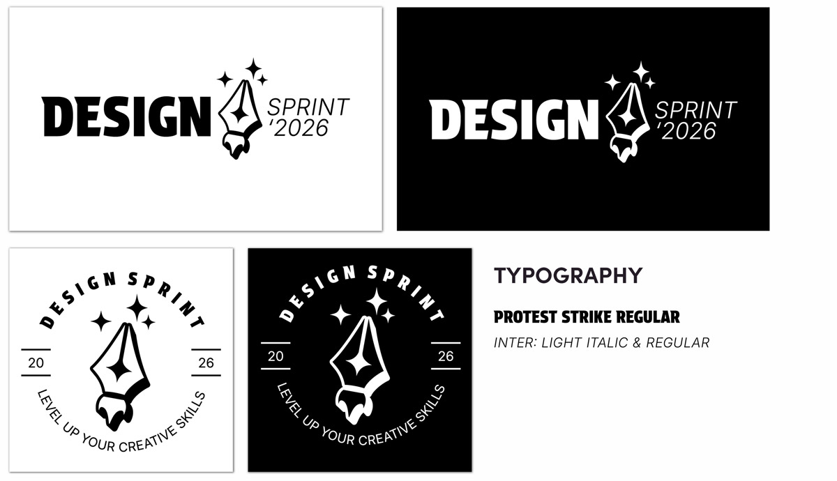
04- The Final Identity: “Creative Momentum”
Concept Explanation

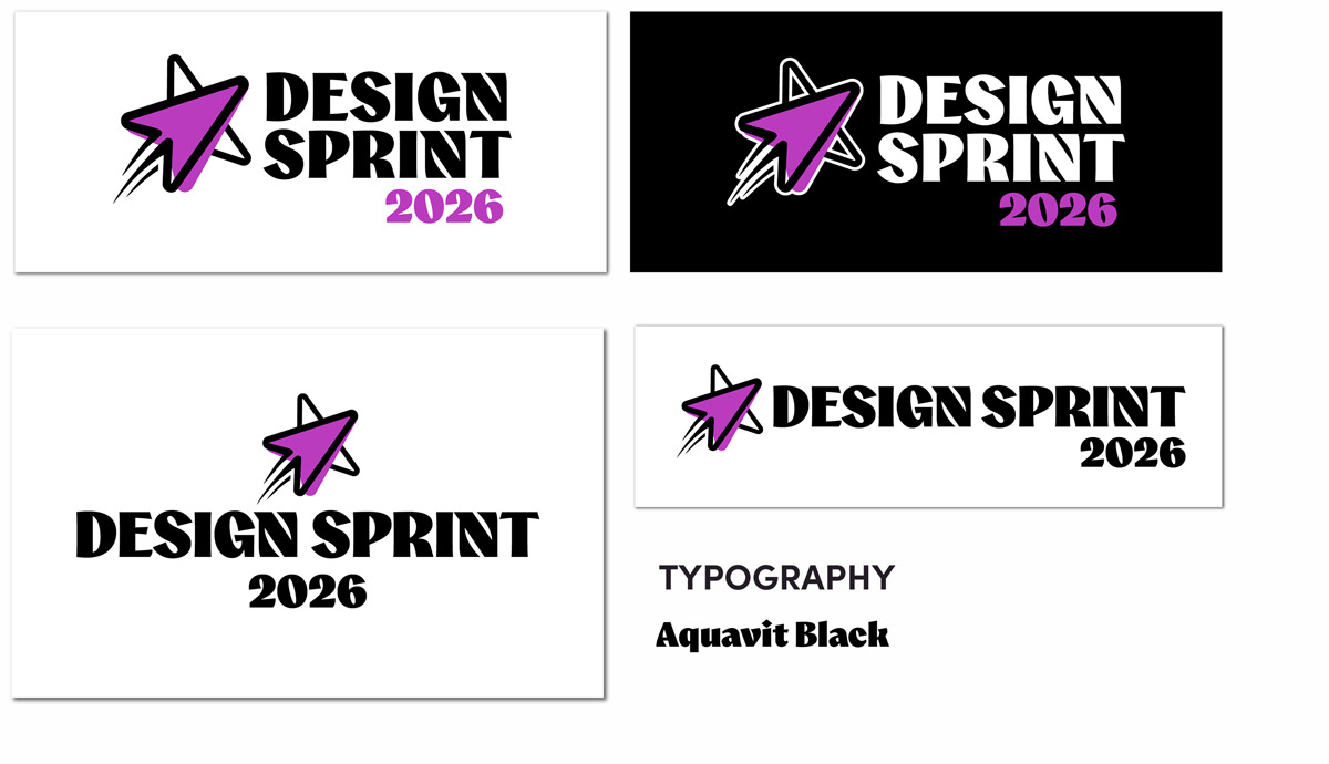
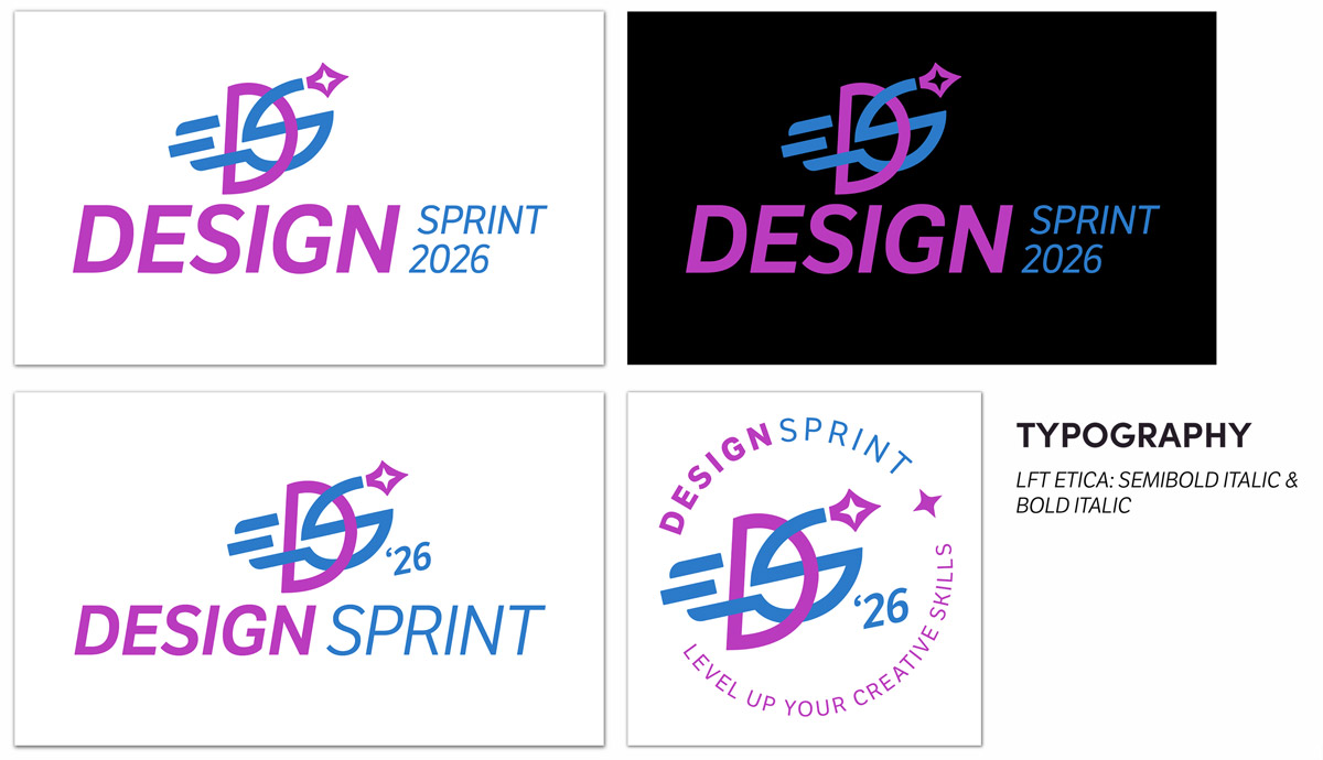
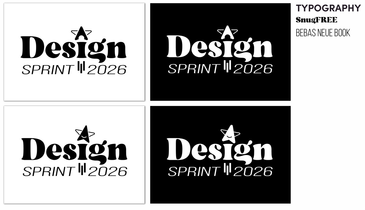
Logo Variations
Colors

Bringing It to Life!

Result & Reflection
This identity successfully unites creativity, energy, and professionalism in a single expression — exactly what Design Sprint stands for. The logo is flexible, inspiring, and future-ready, serving as a strong visual symbol for an international creative community.

