Witt A/S E-Commerce Platform
From Concept to Implementation
The Project
I led the design and development of a web platform for Witt A/S, showcasing over 35 brands and more than 500 products, categorized for easy navigation. The platform serves both as a central hub for all brands, and as individual web shops when necessary.

ROLE
✅ UX/UI Design
As a UX/UI designer at Witt A/S, I play a key role in designing, developing, and implementing the company’s web-platform and other digital products. My primary focus is on creating a seamless user experience and ensuring that our digital products meet the company’s high standards.
- I was responsible for designing an intuitive, visually appealing interface that catered to user needs while maintaining a consistent, modern look.
- Developed design templates and Witt’s design system, ensuring consistent implementation of typography, color schemes, and UI components across the platform.
✅ DynamicWeb CMS Implementation
- Leveraged DynamicWeb CMS to build a fully functional web platform. This included data integration, information architecture, product and campaign page creation.
- Developed registration forms, discount codes, and interactive elements to enhance the user experience.
✅ Ongoing Development
- Contributed to continuous platform improvements – refined existing features, incorporated user feedback, and enhanced the overall performance and user experience.
✅ Marketing Campaign Graphics
- Designed graphic content for various online marketing activities in collaboration with the marketing team and B2B clients. This included SoMe Ads, static and animated HTML5 banners, landing pages, and presentations that drove engagement and supported successful campaigns.
Project Results
✅ E-Commerce Platform Launch
Transformed Witt’s outdated site into a functional e-commerce platform, integrating 35+ brands and over 500 products, meet the company’s high standards.
✅ Improved User Experience
Introduced user-friendly navigation, advanced filtering, and easy access to product details, providing a seamless shopping experience.
✅ Boosted Brand Visibility
Showcased brands with engaging visuals, multimedia, increasing product visibility and user engagement.
✅ Enhanced Marketing and Support
Implemented robust marketing tools and customer support features, driving successful campaigns and improving customer satisfaction.
Overview
Witt A/S is a distributor of over 35 luxury brands and operates across the Nordics, the UK, Ireland, and the Benelux countries. Witt’s product line includes electrical appliances, outdoor gear, and gourmet experiences. The e-commerce platform needed to strengthen Witt’s market position as a leading brand house, while offering a seamless experience for both B2B and B2C users.


Process
01
Define
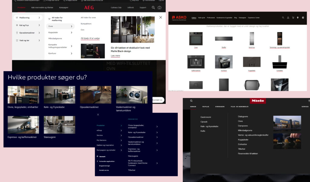
Competitor analysis and user stories guided the development of essential features.
Key findings emphasized intuitive navigation, engaging visuals, and seamless user experiences.
02
Ideate
Developed core features: brand showcasing, store locator, product filtering, strong search functionality, and more.
Created low-fidelity wireframes to define the site structure.
03
Design
Designed high-fidelity wireframes using a 12-column grid system for consistent visual alignment.
Established a design system to ensure cohesive UI across the platform.
04
ITERATE
Incorporated design changes based on user feedback and ongoing testing.
Define
Research
I began by aligning my design approach with Witt’s core values, focusing on their ability to convey innovation, quality, and functionality. I drew from existing marketing material to ensure the platform reflected the principles that resonate with Witt’s customers.
Keywords: Innovative, Quality, Design, Unique, Functionality, In-demand, Luxury, International, Long-lasting.

Target segmentation
Witt primarily targets the Scandinavian region, with additional markets in the UK and Benelux countries. The platform needed to cater to both B2B and B2C customers across different age groups, ranging from 20 to 60 years old.

Competitor Analysis
I conducted a competitor analysis to identify key features and navigation strategies. My findings informed our design choices to enhance user experience: Key Findings:
- Seamless Discovery: Users should easily find products, brands, and information.
- Visual Engagement: High-quality images and videos were critical to enhance product presentation and enhance user interaction.
- Streamlined Navigation: A simple and logical navigation structure was essential for frictionless browsing.
User Stories
To guide the platform design, I developed user stories reflecting different user needs:
🧑🦰 As a new visitor, I want a clear and engaging introduction to Witt’s mission and product offerings so I can quickly understand the brand’s value.
🧑🦰 As a new visitor, I want easy access to detailed product information, helping me make informed purchasing decisions with minimal effort.
🧑🦰 As a new visitor, I expect an intuitive, user-friendly interface that allows me to explore products and navigate the platform without confusion.
🧓 As a returning visitor, I want quick access to articles, news, and product updates so I can stay informed about Witt’s latest releases and offerings.
🧓 As a returning visitor, I want simple sharing options to recommend Witt products to my network via social media or email.
🧓 As a product owner, I need easy access to product manuals and guides, so I can quickly find information for setup or troubleshooting.
Ideate
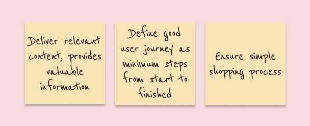
The primary goal was to create a seamless user experience by simplifying the journey from discovery to purchase. I focused on designing a straightforward, user-centric site that delivers relevant content and minimizes the steps needed for users to achieve their goals.
Key objectives
✅ Provide clear, valuable information that helps customers make informed decisions.
✅ Ensure a streamlined shopping process with as few steps as possible.
✅ Create intuitive online tools that guide users to the products and information they need.

Core/Essential features
To meet these objectives, I identified essential features for the platform, including:

- Comprehensive brand showcase
- “About Witt” section to communicate the brand’s mission
- Store locator
- Organized product structure for easy navigation
- Filtering options by category and subcategory
- Robust search functionality
- Product reviews and awards
- App reviews and download options
- User manual search with download capability
- Media server for videos and images
- Company news and press releases with downloadable media
- Information on company fairs and VIP events
- Tips & Tricks section
- Catalog review functionality
- A responsive support system
- 3D virtual showrooms for immersive product experiences
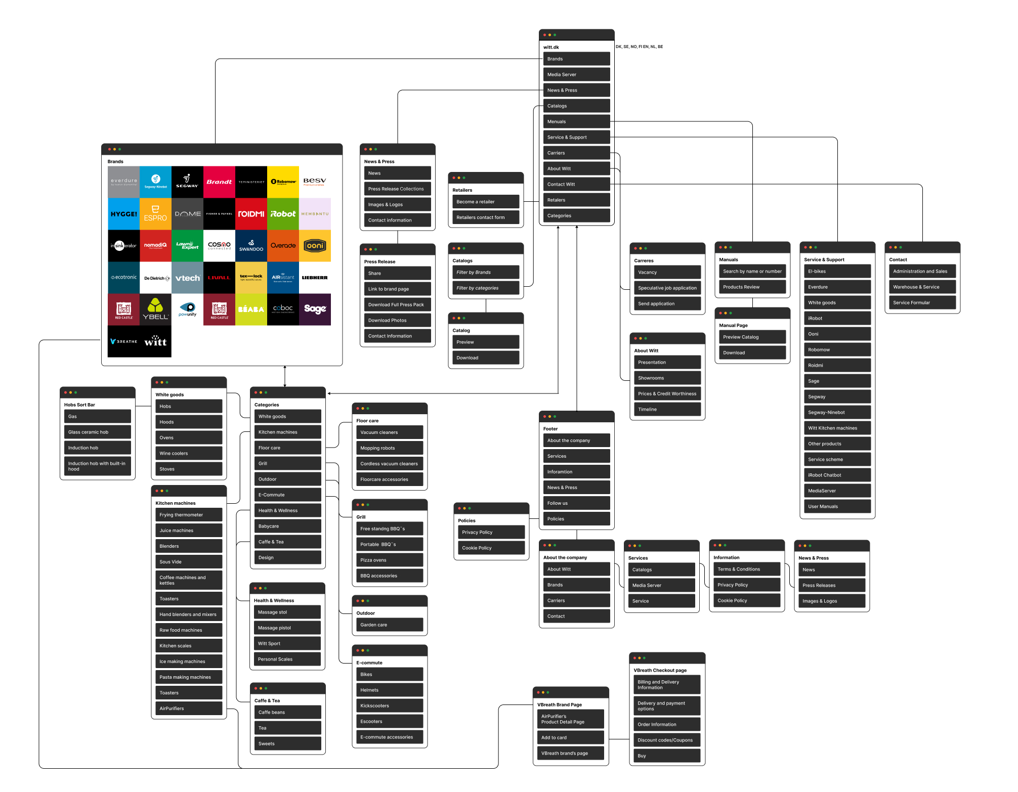
Site Map
Developed a clear, user-friendly site map to structure the navigation and improve user flow.

Low-fidelity Wireframes
Initial wireframes were hand-sketched, allowing for quick iteration. After gaining consensus on the structure, I transitioned to mid-fidelity wireframes in Sketch, utilizing a 12-column grid system to maintain consistent visual alignment.
Design
High-fidelity Wireframes
High-fidelity wireframes were developed to reflect the final design, focusing on maintaining a visually cohesive user experience.
Design System
Established Witt’s design system to guide both designers and developers, ensuring uniformity across the platform.


ITERATE
Feedback Incorporation
Throughout the project, I refined the designs based on feedback, optimizing both performance and usability.
Campaign Setup
Witt’s Wine Cooler Campaign
As part of the marketing efforts, I designed and implemented several key campaign elements:
👉 Landing Page: Developed a dedicated page promoting Witt’s Wine Coolers, featuring key product details and compelling CTAs.
👉 Info Brochure: Created a brochure for distributors to showcase the wine coolers in physical stores.
👉 Banners: Designed a series of banners placed on distributor pages to drive engagement.
👉 Registration Form: Developed a form to collect customer details, with incentives provided for participation.


